Gallery design & stylesLite
Design each gallery to match the shoot: start from a designer template, or style it yourself — a cover photo, a layout, a theme — and save the combination as a preset your whole studio reuses. A handful of free templates apply on every plan, full page-layout templates and the design layer are Lite and above, and the hero slider, column controls, and collages are Studio and above.
Free, on every gallery
Even a gallery you never style opens on an intentional hero: a gradient cover with the project title and a date · photo-count line, above the classic look — a uniform grid on a light canvas, rounded tiles. Folders group under uppercase section headers. Basic means non-configurable, not unstyled. The basic slideshow works on Free too — it just plays silent (pace and motion below). Favorites, selections, downloads, and every delivery control on Delivering galleries are never gated.
Start from a template
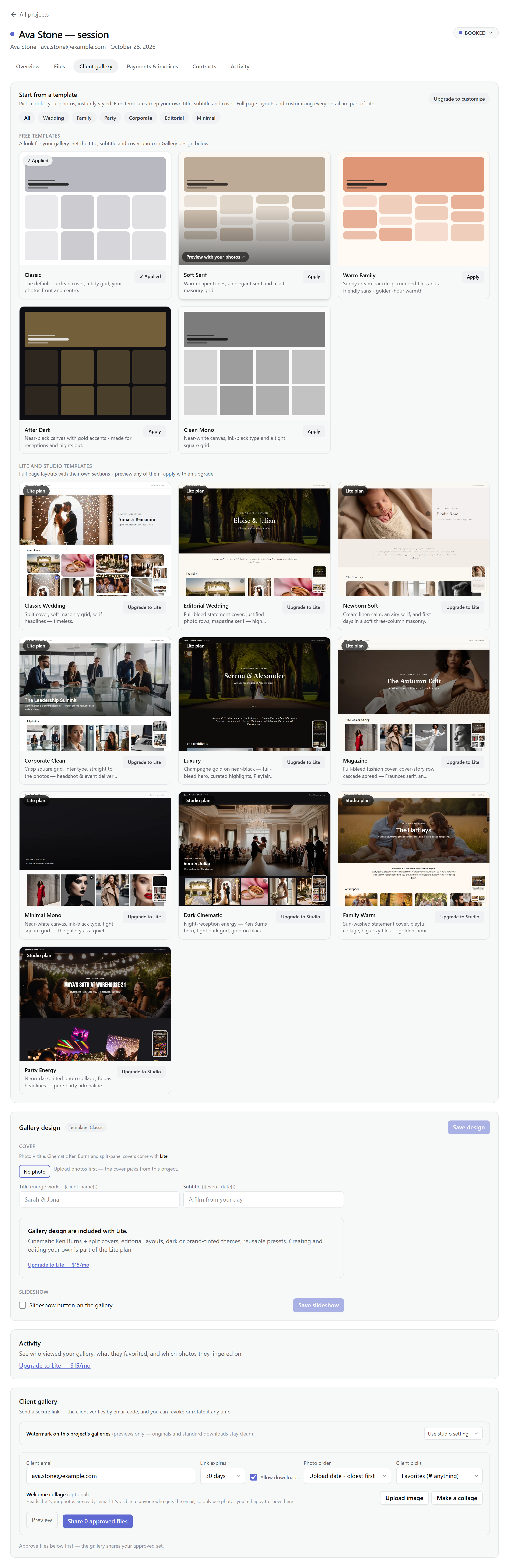
The Client gallery tab opens with a template picker — fifteen designer templates in two groups. Free templates — Classic (the default every gallery starts on), Soft Serif, Warm Family, After Dark, and Clean Mono — are a look: layout, type, and colors. They carry no copy of their own, so your title, subtitle, and cover photo from Gallery design stay exactly as you set them when you switch. Lite and Studio templates are full page layouts — wedding, family, party, corporate, editorial, and minimal — with their own sections and photo placements; you can preview every one with your photos on any plan, but applying is gated on the server: Lite for the page layouts, Studio for the three collage ones. Undo brings your previous design straight back, and applying is design-only: photos, favorites, and delivery settings stay untouched. The full roster is on Gallery templates & page builder; making a template yours is the page builder, Lite and above.
The design layer Lite
Open the Client gallery tab on any project and the designer sits below the template grid, beside a live phone-frame preview. The Cover section renders for every plan; what Lite unlocks is everything around it — layouts, themes, cover motion, presets. On Free the upsell card sits below the cover, and saving accepts a cover-only design or an untouched free template with your own cover — customizing one takes Lite.
Cover
Pick a photo from the project, drag its focal point so the crop lands right, and add a title and subtitle — this much is free on every plan. Title and subtitle accept merge fields — {{client_name}}, {{event_date}} — rendered per viewer. Lite adds the styles: static (a still hero), Ken Burns (a slow drift), or a split title panel; on Free the cover is the static photo-plus-title hero. No photo picked? It falls back to a text-only gradient hero, so presets never depend on a specific project's images. Every photo hero wears a soft vignette — darkened edges that frame the image.
Hero slider Studio
Swap the single cover for a carousel of 2–6 photos. Click thumbnails to add them in order — the first photo leads, and it's the one clients see when the link unfurls in a chat or social card. Each slide keeps its own focal point; a dropdown picks which slide your drag edits. Clients swipe the strip (arrows and dots too), and optional auto-advance (4, 6, or 8 seconds, or off) never runs for people who prefer reduced motion.
Layout
Grid (uniform rows), masonry (natural heights, no cropping), or cascade (an editorial, mixed-scale flow). On grid and masonry, Studio plans set the density per screen Studio — 2–3 columns on phones, 2–3 on tablets, 2–5 on desktop, with a phone floor: a phone never shows more than two grid columns, whatever the count asks, and masonry stacks as one full-width column so landscape photos keep their size. Photo gaps sit at a 4px floor on phones — the pictures carry the layout — and your chosen compact, normal, or airy spacing returns from tablet width up. The whole ladder responds to the gallery's own width, not the browser's, so the preview's phone shell renders exactly what a real phone will. Fewer columns, bigger photos. Cascade keeps its justified rows and hides the control; leave the counts alone and the classic 2 / 3 / 4 ladder applies.
Theme
Light, dark, or a brand tint mixed over your studio accent. Then the details: compact, normal, or airy spacing; square, 8px, or 16px corners; captions off, on hover, or always (a tile's caption is its filename, minus the extension).
Preview as your client
See exactly what the client will see before anything is sent. The Preview button sits next to Share on the Client gallery tab, opening the gallery at /g/…/preview in a new tab — on every plan. Your dashboard session is the only key: no grant, no email code, and a signed-out visitor gets the same neutral 404 as any unknown gallery link. It's the real client view — the approved-and-shared set a fresh link would carry, your watermark and privacy settings applied — under a banner with a desktop/mobile toggle and a shortcut back to sending. Downloads, selections, and sharing stay off until the real grant's settings exist, and preview opens never count as views.
Presets and your studio default Lite
Save any combination as a named preset in your template library, and pin one as the studio default — new galleries start styled instead of classic. Applying a preset keeps the gallery's current cover photo and takes everything else from the preset; editing a preset never rewrites galleries already sent. Presets are for looks you Presets are for looks you composed yourself — the seeded designer templates apply as-is within your plan's tier and never count toward your saved-look limit — and a saved look that carries builder sections counts toward Lite's one saved custom look.
Slideshows
Pace is 3, 5, or 8 seconds per photo; motion is a plain crossfade or Ken Burns. A vertical 9:16 mode reframes the show for phones — built for Stories and Reels (the client records their screen to save it). Music is bring-your-own Lite: MP3, AAC, or M4A up to 15 MB, uploaded once to a studio library and reused across every gallery. You tick a box confirming you own the rights, and can set where the track starts. On Free the slideshow plays silent.
Note: Turning on a Films section is also a design-tab switch — see Films & video delivery for how videos render.